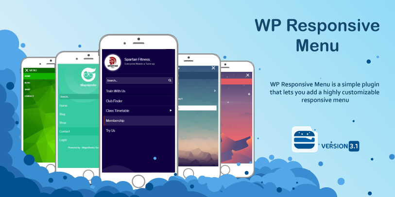
WP Responsive Menu is a user-friendly, highly customizable, responsive mobile menu plugin.
Using WP Responsive Menu plugin you can easily get highly customizable mobile menu plugin for your wordpress site. This plugin can easily convert your website menu to a great looking slide menu for mobile devices.
- Fully responsive and works on all type of mobile devices.
- Easily integrates with wordpress menu system.
- Easy to use admin interface.
- Easily replace your menu with responsive menu on mobile devices.
- Choose your custom colors to match your theme.
- Option to open menu from top, left and right.
- Easily add your website logo the the menu.
- Easily hide unwanted elements on mobile devices.
- Supports swipe gestures.
- Enable/Disable pinch to zoom feature.
- Works great on all type of mobile devices.
Try The Demo
- Fully Responsive and Works on All Type of Mobile Devices
- Easy Automatic Integration with the WordPress Menu System
- Create Custom Menu’s Just for Mobile with submenu support
- Easy to Use Admin Interface
- Replace Your Menu with a Responsive Menu on Mobile Devices
- Style the Color of Text, Backgrounds and More from the Settings Tab
- Set Option to Open Menu from Top, Left or Right
- Add Your Logo or other Images to the Mobile Menu
- Hide any Elements You Don’t want on Mobile Devices
Looking for something more?
Check out the PRO version features and get 100% support, regular updates with lots of customisation options.
Checkout Pro
Perfeito! Instalei o aplicativo e funcionou bem, mas ele aumentou todos os elementos do site. Como posso colocar ao normal?
Hello,
Can you please be specific to what exactly you are trying to achieve.
Regards
[…] https://www.magnigenie.com/wp-responsive-menu-mobile-menu-plugin-wordpress/ […]
[…] Most of the plug-ins I tried didn’t work with the theme I was using. I finally found the word press responsive menu which made it simple to remove elements of my website and have an easy to use drop down […]
[…] mobile menu plguin. Using WP Responsive Menu plugin you can easily get highly customizable … Download WP Responsive Menu – Mobile Menu Plugin For WordPress … | […]
[…] Hvis du lige som jeg laver dine egne designs, men mangler at få menulinjen til at fungere ordentligt på mobile enheder, så har du brug for et plugin, der tilpasser sig. Jeg har brugt en del tid og afprøve forskellige plugins til dette formål, og jeg har nu fundet frem til det plugin, jeg synes, der fungerer allerbedst. Det er gratis og hedder, WP Responsive Menu. […]
[…] and starting by writing the content directly in. Then I’ll add some plugins including WP Responsive Menu for smart phones which is really handy, and do the look and feel […]
Hi Nirmal, I've installed your plugin, it's picking up the custom menu I want it to apply to, that menu is being hidden correctly when I view the mobile version as opposed to the desktop version but I can't see the #wprmenu_menu bar at the top of the screen, even though the page has been moved down to make way for it and I can see all of the JS/CSS code that the plugin has inserted at the top. Help, what am I missing?!
Much appreciated!!
Andy
Nirmal, for what it's worth, I've identified that it's a problem with my own theme, but I don't know what I should be including to get your plug-in to work. Thanks, Andy
Hi Andy,
Can you share your website URL ?
Hi,
How can I make the menu icon not move.
When I add a top bar (WP TopBar) the menu icon moves to the top where the top bar is.
Hi Sean,
I am quite not sure what exactly you mentioned. Can you share a link to your website so that I can check and provide you a solution.
Thanks
- Nirmal
Hi Nirmal...installed on my site this morning, have Genesis Sample theme. cannot hide menu on main site...tried a few things...can you help. Disabling until I can get this fixed.
Thanks.
Sam
Please share your website url and I will get you the required settings.
Hi Nirmal, thanks for this great plugin, much appreciated.
Same problem here, swipe action is not working fine... I think it is too sensitive so the menu swipes out without user awareness of doing such gesture consciously. As a workaround I have selected open from top, but it's nicer from left or right.
Kind regards
Hi. The plugin works great on the home page but does not work on the subpages. I already tried disabling the sidebar Nav, in case there was a conflict, but that wasn't the problem. Any ideas? Thanks
Hey! I think this plugin will be awesome once i get it to work! On my site when you click the hamburger the whole page slides to the right leaving a blank page. as it slides i can see the menu appearing but then everything disappears... are there any known plugin clashes? supersized for example? cheers
Is there a way to put a search (magnify glass) in the top right on mobile devices. I would love this plugin if it had search option.
Hi. Great looking plugin! I want to use it on this new site I am building (http://kenston.org/newsite/). I am having one odd issue with it, though. The menu opens beautifully on the HOME page, but will not open on any of the sub-pages. Any ideas?
Tnx!!! It works.
Bert
Hi Sagar,
Tnx for your reply. Is this the text I put in hide elements:
.only-search with-image,#access
Please, let me know so I understand it correct.
Tnx!!
Bert
Yes, you are right.
Hello Nirmal,
I don't know much about ccs. I want to use your great plugin and on a mobile device the main navigation menu must not show. In your plugin you can use the option to hide the ccs menu element. But I haven't any idea how to identify the class/id on my website to hide the main menu element and what code I write at this option. This is the url of my website http://www.innae.nl
Please can you help me
Thanks in advance!
Bert van Lith ( Netherlands)
Hi,
I checked your site and it seems like you have deactivated the plugin on the site ?
I am sorry Nirmal. I named the wrong url. This is the url with plugin installed: http://www.alltangsoodo.org
I a said before. What is the name/code of the element that hide the main menu if the plugin is active on a mobile device.
I hope you can help me.
Thanks again!
Bert
Hi Bert,
Here is the details you seek. Just put
.only-search with-image,#accessin hide elements and it would work. I would soon release a video so that people can get this easily.Thanks
- Sagar
Love the plugin, works great. I do have a small issue though, on the iPad, the pop-out appears sometimes and I cannot close it. I have disabled the plugin for over 320px but it still appears for no reason sometimes when swiping the screen to move the browser up or down. Is there a way to completely disable the functionality for browsers above 320px?
thanks
Dave.
Hi Dave,
Can you please send me your website link so that i can check this.
Thanks
- Sagar
Responsive Menu is not displaying in iphone tabs with a width of 1024px..
Can you please share your website url so that I can check and let you know.
Hello,
That plugin not working on my webstie 🙁
Dear Mr.Nirmal,
Your plugin great , I am really interesting it . what I need is I need change only menu responsive but keep the whole of content of website . Please help me .
Many Thanks ,
Sithon
Hi Sithon,
I couldn't get you. Can you please explain what exactly you need to do ?
Thanks
- Nirmal
Hello Nirmal Ram, thanks for sharing!
Fix make submenu dropdown clicking on parent...
SOLUTION
From Buenos Aires, Argentina, Martin Rodriguez, shares the following solution:
1) Locate the folder of the plugin (usually):
"wp-responsive-menu > css > wprmenu.css"
2) Then at the end of the file, add these lines:
/* Contributed by Martin Rodriguez from Argentina */
/* Fix make submenu dropdown clicking on parent */
.wprmenu_icon.wprmenu_icon_par.icon_default {
width: 990px !important;
}
Best Regards,
Linksbreaker
great plugin in. I've active it and it works perfect except it shows the original navigation button which makes the website has 2 menu when I view in mobile,
I cant find the class/id selector to put in the "hide elements" part.
could you help to find the id/class so i know what I should put to hide?
Thanks!
-F
Hi Nirmal,
I switched to Twenty Thirteen and of course you were right. I've fixed for the moment by adding a height value to #wprmenu_menu.top. Thanks for sending me on the right track. Beer en route.
Hi John,
I am glad that you figured out the issue and thanks for the BEER.
Cheers,
- Nirmal
Hi Nirmal,
Thank you for this great plugin! It works perfectly except for one problem: it does not display the last menu item, Contact, from the main menu. Is there a limit to the number of items it will display?
Thanks,
John
Hi John,
It doesn't have any limitation on the number of menus. I guess you are having issues because there is some conflict with your theme. Can you switch your theme and check if it works.
Thanks
- Nirmal.
This throws an error in IE7 which causes other scripts to stop working.
The error comes at "window.addEventListener("orientationchange",y,false)", Object doesn't support this method.
The fix I implemented was "if(window.addEventListener){window.addEventListener("orientationchange",y,false)}else{window.attachEvent("orientationchange",y)}".
Hi and thanks, but we can't figure out how to not go to a page when we click on the top level.
For exemple if you click on "Våra program" we don' t want to go anywhere.
Heya, I'm in the process of building a custom WP theme (it's quite barebones at the time of posting this). I installed your plugin but it doesn't seem to do anything. I'm wondering if I'm missing something (some code to pull it into my theme or something). To test it, I tried activating one of the default WP themes, but it didn't seem to do anything with those either. Any ideas how I can get this to work? You can see the site I'm building on our staging site here: http://davidtaylordesign.biz/lodgingadvisors/
Thanks!
Hi Dave,
I guess you need to do the admin settings for the plugin to make it work unless you already did that.
Thanks
- Sagar
Hello,
We are currently using your menu and love it! The only thing we noticed, though, was that sometimes the menu opens when scrolling the page -- even if you dont get close to the menu. Is there anyway to prevent this from happening?
Thanks!
Hi Shawn,
The problem is that the swipe sensitivity on the plugin is bit high and i guess that's the reason the menu is opening when scrolling. A quick and easy fix would be to open the menu from top instead of left or right.
Cheers
- Nirmal
Hi Nirmal,
First of all thanks a lot for your great plugin. Everything is working out of the box but the "Allow zooming on mobile devices? " which is not working on my testing site at:
http://chacinasmendez.com/index.php
Have you also noticed that in any other site using your plugin?? My guess is that the feature may work only with responsive designs... but only guessing.
Thanks a lot in advance.
Javier.
Hi Javier,
I saw your site and it doesn't look like it is responsive but the menu is for responsive website. If you want you can use some responsive wordpress theme and use this plugin.
Thanks
- Nirmal
Hey, is there a way to make the "topmenu", work the same as the "rightmenu"and "leftmenu", with the close button?
Great plugin btw! Thanx!
Hi,
Currently this is not possible with the current version of the plugin. Soon i will release a new version which would have this functionality.
Thanks
- Nirmal
Hey great plugin, i'm trying to get the action working in the top menu. If you use the menu/left or menu/right the icon next to menu changes (to a cross), this action does not happen in the "top menu". Am i doing something wrong? Thanx in advance!
Hello Nirmal, I used your plugin and this is working well.
However I have an issue with the "touch" event. This error occurs when my website displays a slider which has the touch event.
When dragging this slider to the right, the menu appears, so it is no longer possible to drag the slider.
Do you think this issue can be fixed ? or may be how to deactivate the touch event on the menu ?
Thank you for you answer !
Sylvain
Hi,
I understand your problem and actually its currently not possible to disable swipe with current version of the plugin. But you can solve this if you make your menu open from top instead of left or right.
Thanks
- Nirmal
When active the plugin, in smartphones displays the two menus, desktop (#navigation) and wp responsive menu. What am I doing wrong?
THX anyway
Hi Rafa,
There is an option on the plugin settings where it says hide elements on mobile. You just need to put the class/id selector of your site. If you are having difficulty in finding id/class then let me know your website url.
Thanks
- Nirmal
Opps! sorry I didn't see this option yesterday, maybe a little tired... Now works like a charm, thank you very much. This is my site: http://www.rnlagos.com
You have a little syntax error on wprmenu.css in line 83 (margin:0xp;)
Hi Nirmal,
Trying to delete the the theme`s menu, I success to delete the Menu button, but the navigation block still remain. I guess it .menu-toggle, #navbar, .navbar - but can`t hide it. Can you help me, pls.
http://noahideworldcenter.org/wp_de/
Hi Nathan,
You need to put #site-navigation in hide elements on mobile and it will be fixed.
Cheers
- Nirmal
Still here)) But I assign to it another menu, so it not so bad - I could have two different menus:)
I have got problem when using your plugin.
once I logout, and then the responsive menu also disappear..
it only works when you are login in wordpress website.. however, when u logout, it disappear suddenly.
help me plz.. send me an email. thanks
great work
Hello,
We love your plugin; it finally let us accomplish a truly working and functional responsive menu! Can I turn off the swiping action? It inteferes with another function on our site, so we just want te menu to be controlled exclusively with the 'x' at the top. Thanks!
Hi,
Currently it is not quite possible to disable the swipe action from the admin options. I am planning to add that to next release of the plugin. If you really need it then i can do that for you.
It's really amazing plugin! It really helped me to modify responsive design of my website. But is there a possibility of linking a custom page/post/home to Logo/Text in menu bar? That only "triple line" button will expand the menu, while "logo/title" will go to home screen (or elsewhere). Thanks!
Thanks, Currently the plugin doesn't have an option to that. But thanks for the idea. May be in my next update i will add that feature.