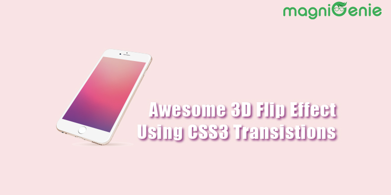
CSS3 transitions are a great way to create awesome animation effects without writing any javascripit/jquery. In this article I am going to demonstrate how you you can use CSS3 transitions to create awesome 3D image flip effect. There are also couple of jquery plugins available to achieve the same effect but I like the CSS way as I am fascinated by CSS#. Here is a demo of what we will be building.


So let's get started.
Here is the basic HTML Code that you would need to generate your markup
[html]
<div class="mg-flip-container" ontouchstart="this.classList.toggle('hover');">
<div class="mg-flip-content">
<div class="front-side">
<img src="https://www.magnigenie.com/wp-content/uploads/2015/01/front.png" alt="front" width="277" height="503" class="aligncenter size-full wp-image-3079" />
</div>
<div class="back-side">
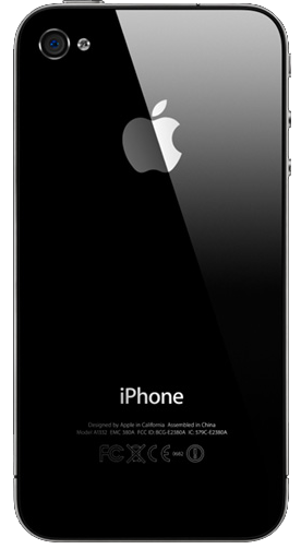
<img src="https://www.magnigenie.com/wp-content/uploads/2015/01/back.png" alt="back" width="276" height="503" class="aligncenter size-full wp-image-3078" />
</div>
</div>
</div>
[/html]
Now let's write some cool css3 codes to create an awesome 3D flip effect.
[css]
.mg-flip-container {
perspective:1000px;
}
.mg-flip-container:hover .mg-flip-content,
.mg-flip-container.hover .mg-flip-content {
transform:rotateY(180deg);
}
.mg-flip-container,.front-side,.back-side {
width: 277px;
height: 503px;
}
.mg-flip-content {
transition:.6s; /* Flip duration */
transform-style:preserve-3d;
position:relative;
}
.front-side,
.back-side {
backface-visibility:hidden;
position:absolute;
top:0;
left:0;
}
.front-side {
z-index:2;
transform:rotateY(0deg);
}
.back-side {
transform:rotateY(180deg);
}
[/css]
So that's all. Now our awesome 3D Image flip effect is ready and you can just copy and paste the above code and get the flip effect within few seconds. Just move your mouse over the iPhone image and see it in action.
